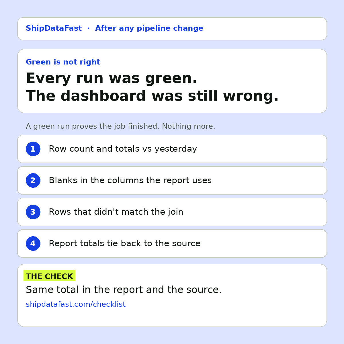
Your dashboard was wrong all week. Every pipeline run was green.
This is one of the most common ways bad numbers reach the business. Not through a failed job, which someone would notice, but through a job that ran perfectly on data that was wrong. A green run tells you the job finished. It doesn't tell you the numbers are right.
Here's what green doesn't prove, and the check I'd add for each.
1. That the source sent everything
A file with half the rows loads just as cleanly as a full one. An upstream extract times out and writes what it had. A source system has an outage and sends an empty delta. The pipeline has no idea what "complete" looks like, so it loads whatever arrives and reports success.
The check: compare today's row count and key totals with yesterday's, or with the same day last week. You don't need a perfect model. A simple band like "within 20% of the recent average" catches the half-file case. Better still, if the source can send a control total, compare against that.
2. That nothing quietly went blank
A column gets renamed upstream. The pipeline looks for the old name, doesn't find it, and loads the column as empty. No error, because empty is a valid value. The dashboard shows zero, or drops the rows from a filter, and nobody notices until someone asks why a region had no sales.
The check: track the share of blanks in the columns the report depends on. If a column that is normally fully populated suddenly has a high share of blanks, stop and look.
3. That the joins still match
Change one key format, and rows fall out of the join silently. A customer ID gets a prefix in one system. A product code changes from upper to lower case. The inner join drops the non-matching rows and the output is smaller, but still valid.
The check: count what didn't match, every run. If the number of unmatched rows jumps, something changed upstream. This is cheap to add and it catches a class of errors that row counts on the output alone won't.
4. That the report ties back to the source
The number finance sees, against the number in the system it came from. Same filters, same date. If the dashboard says revenue for last month was X, the finance system should say X too, or there should be a known, documented reason why not.
The check: pick one or two headline numbers per report and reconcile them to the source automatically. This is the closest thing to proof that the report is right, rather than just that it ran.
You don't need this everywhere
It's tempting to read this and decide every table needs every check. It doesn't. That approach creates so many alerts that people ignore them, which is worse than no alerts at all.
Start with the 3 reports people actually open on Monday morning. The ones that end up in a board pack, or drive a decision, or get forwarded to customers. Add the four checks there first. Then grow from the reports that have caused problems before.
Why green feels like enough
Pipeline tooling is built around job status. It's easy to see green and red, and it's what most monitoring shows. Data correctness is harder to see, so it gets less attention. The result is a team that knows exactly when a job fails and finds out about wrong numbers from someone in a meeting.
That second route is expensive. Not just the time to trace the problem, but the trust. After a business user finds a wrong number once, they start checking everything themselves, and the dashboard stops saving anyone time.
In short
- Compare row counts and totals with the previous run.
- Watch the share of blanks in key columns.
- Count unmatched rows in every join.
- Tie headline numbers back to the source.
Green means it ran. Reconciled means it's right. How did you last find out a report was wrong: a check, or someone in a meeting?